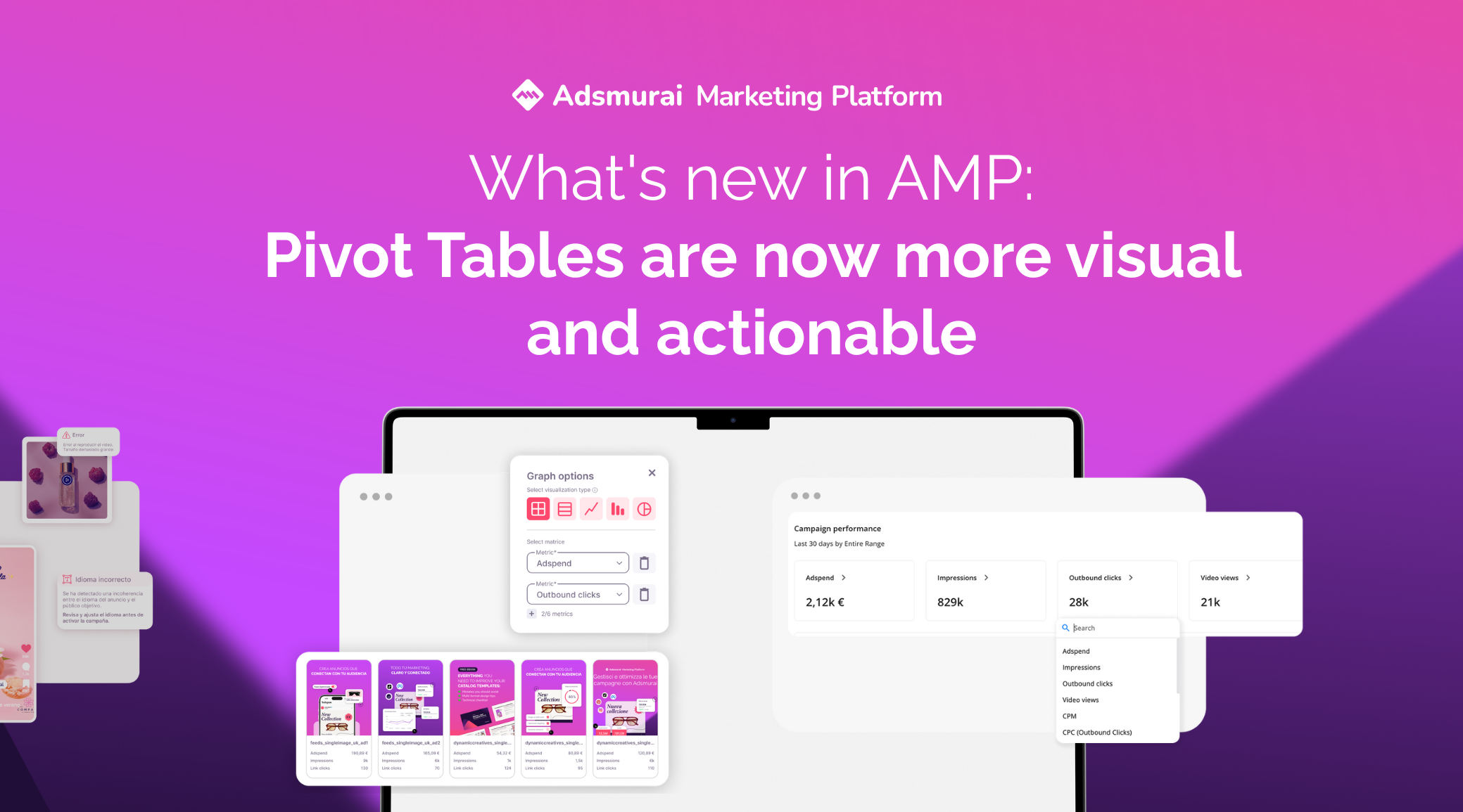
AMP Pivot Tables take a leap forward with two new features that make analyzing and sharing campaigns easier, faster, and clearer than ever. With the new Drawer you can dive into each line of your table without losing context, spotting naming issues and comparing ads in just one click.
And with the Grid View you’ll turn your reporting into a much more visual format, displaying up to 5 ads sorted by the metric of your choice, ready to identify the best and worst results at a glance.
In short: fewer endless spreadsheets, more actionable insights, and a much clearer way to communicate results. Let’s dive into the details 👇
📈 Drawer in Pivot tables
Analyzing campaigns in Pivot Tables is now much easier. With the new side drawer, you can better understand the information you are viewing and drill down into the details without losing sight of the bigger picture.
The problems it solves
Until now, when you wanted to review more detailed information from a line in your Pivot Table, you ended up switching tabs, juggling endless spreadsheets, or wondering if the naming was correctly set up. The drawer solves all that because it allows you to:
- Access extra information for each line at a glance.
- Detect incorrectly mapped fields within your naming convention.
- Compare ads that share the same naming layer, without leaving the table.

How it works
In each line of your Pivot Table you’ll find an ℹ️ icon on the left. Clicking it opens the drawer with detailed information:
- View all your cross-platform campaign data in one place.
- Share insights directly with clients without the need for spreadsheets.
- Easily identify the origin of each ad and, if you need to optimize, do it much more efficiently.
⚠️ Keep in mind
The information available in the drawer adapts to the filters, dates, and pivots you have configured in your table.
🔗Grid View in Pivot tables
With the new Grid View you can now create much more visual reports by displaying up to 5 ads in a single view, sorted directly by the metric you’ve configured in your table.
Benefits for you
- Generate clear and easy-to-understand reports for your clients, without the need to explain every single line of the table.
- Save time by avoiding the need to manually collect ad previews: here you have them all together.
- Quickly identify which ads perform best, which perform worst, and what adjustments you can make to improve results.
How to use it
Within Pivot Tables, select ad-level analysis and, in the chart options, enable the Grid view. You’ll instantly see the ads displayed as cards, ready to share or analyze.

⚠️ Things to keep in mind
- Dynamic ads do not have a static preview: you’ll need to view them by clicking on the image or the preview text.
- The Grid View shows up to 5 ads, always sorted by the metric you choose in the table.
- This option will only be available when the time grouping is set to complete.
